Case Study - Sharon Public Library Redesign
As part of the User Experience Design program at Kent State, we were asked to choose a library website and perform a comprehensive analysis and subsequent redesign. A complete review of the website, discovery processes and user research were all employed in order to learn about library websites, how they can best be optimized to serve users and their needs. Stakeholder interviews also helped us gather information about site requirements and what is needed to help library staff serve the community effectively.
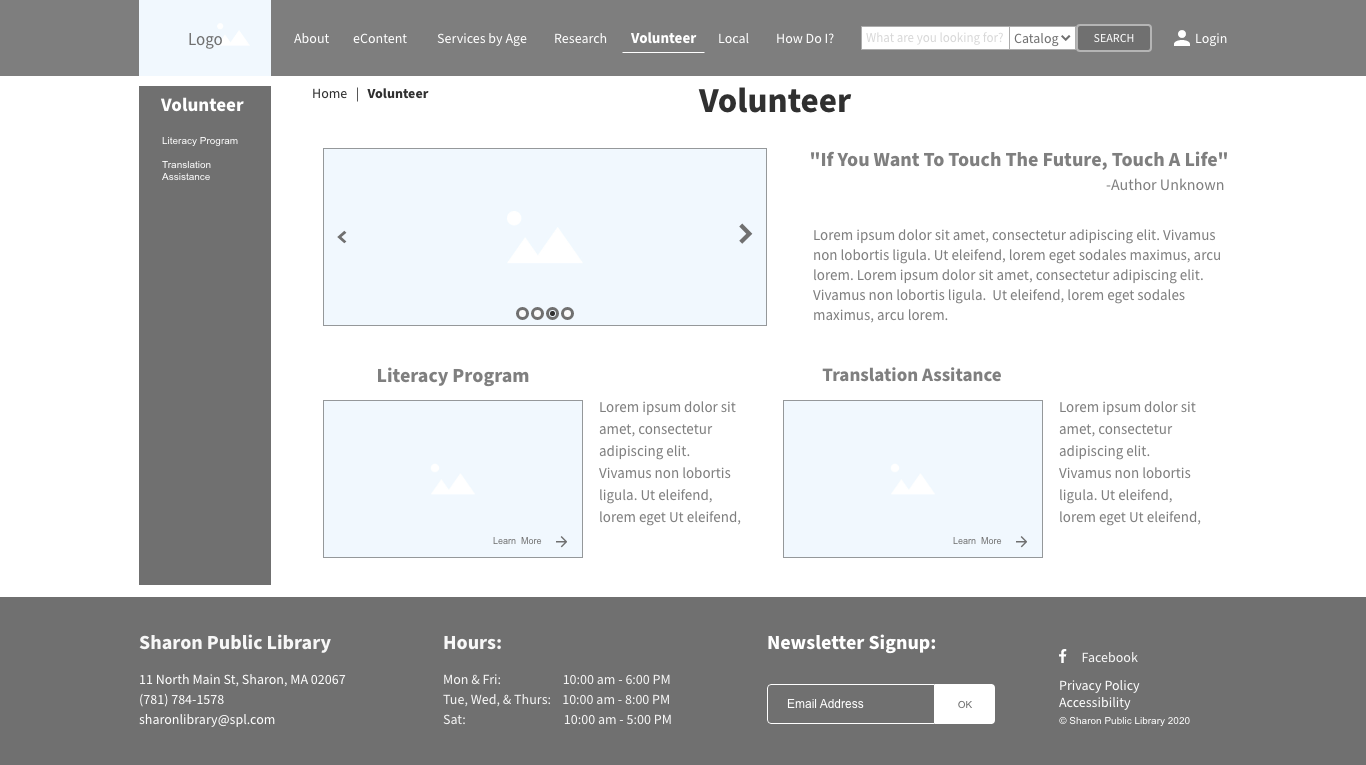
Original Homepage, several usability issues were discovered.
Project Goals
Information should be easily accessible by users.
The website structure should innately help users find content.
Incorporate thematic elements to welcome users.
Information architecture problems need to be identified to solve usability issues.
Research Methods
The following research activities were performed in order to develop a deeper understanding of library website users, their common site tasks, the library’s communication goals and what information stakeholders need to relay to the community:
Review of Labeling & Taxonomy – Ensured that what things are titled or labeled on the site make sense to users.
Content Review / Analysis – Underscored where content needed to be reworked, combined or removed. Also provided insight into the current site condition.
Site Map Creation - Helped in analyzing the current website hierarchy and present changes to stakeholders.
User Interviews / Task Analysis – Uncovered what users needed to do on the site and how the process could be simplified.
TreeJack Testing – User testing to validate proposed navigation labels and user's chosen navigation paths using these labels.
Chalkmark Testing – User testing to evaluate website wireframes to understand where users would click in order to start a proposed task. This is done by asking users to click on an image to begin a given task.
Findings
Secondary navigation is too far down each page on mobile devices, reduces findability, and lowers the number of conversions child pages receive.
Dropdowns have far too many items and are composed of terms that may not be understandable to users or could be misinterpreted.
The site does not include a global search option, this makes it difficult for users to look for content when they are unsure of terminology used or where the content is located.
The incorporation of too much information on pages causes information and navigation items to become lost. This is further aggravated by the use of incongruent graphic navigation elements that are randomly placed about the site.
There are several ADA Compliance issues involving contrast errors and alternative text. Such site issues may cause accessibility problems for those with disabilities, these can lead to complaints to the Office of Civil Rights and subsequent lawsuits.
Personas - User & Stakeholder
Using uncovered requirements and data concerning libraries, their use, and users, several personas were created. These personas were used to inform design efforts to increase overall usability and build user empathy.


Tasks by Persona
After analyzing all collected data and cross referencing the created personas, tasks were developed that incorporated user requirements. Different personas have different requirements for the site and this exercise helped to illustrate which tasks would impact different personas.
This exercise was important so that tasks could be developed that would test users that interact with the website differently to ensure that the site support all users fairly.